A pie chart is a circular statistical graphic divided into slices to illustrate proportions of a whole. In a pie chart, the arc length of each slice represents the data values. There are different types of pie charts available that are helpful in displaying details of different types of data.
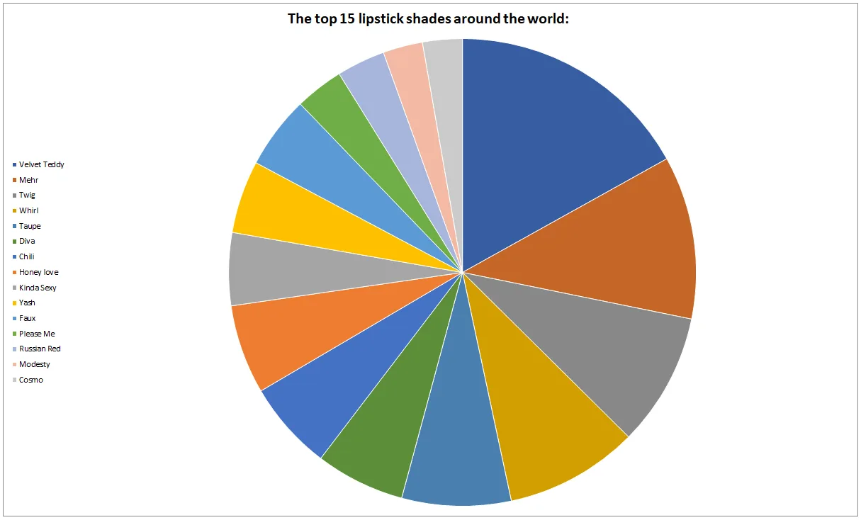
You can review this data using the various pie chart types below if you would like to see the top five beauty products in the world.
Rank
Beauty Products Worldwide
Number of Countries
1-
MAC Lipstick Velvet Teddy
46
2-
Benefit They’re Real Lengthening Mascara
21
3-
Anastasia Beverly Hills Dipbrow Pomade
20
4-
Laura Mercier Translucent Loose Setting Powder
9
5-
MAC Lip Pencil Cork
8
Why do we use a pie chart?
Because pie charts are effective for the following reasons:
It clearly shows proportions at a glance. Large and small portions can be easily compared with this type of chart. It also makes it easy to examine differences in data values.
Their simplicity in representing data makes pie charts ideal for audiences who are not as familiar with complex data visualizations.
To create an effective and accurate pie chart, avoid the following:
The number of slices plays an important role in making a pie chart effective. Too many slices make the chart difficult to understand because it becomes difficult to distinguish between many small pieces. Therefore, it is recommended that the number of slices should not exceed 6.
Slices of the same size can be confusing to the audience. When slices appear to be roughly the same size, it becomes difficult to make accurate visual comparisons. For data where most of the values look roughly the same, other charts, such as bar charts and pie charts, are more effective.
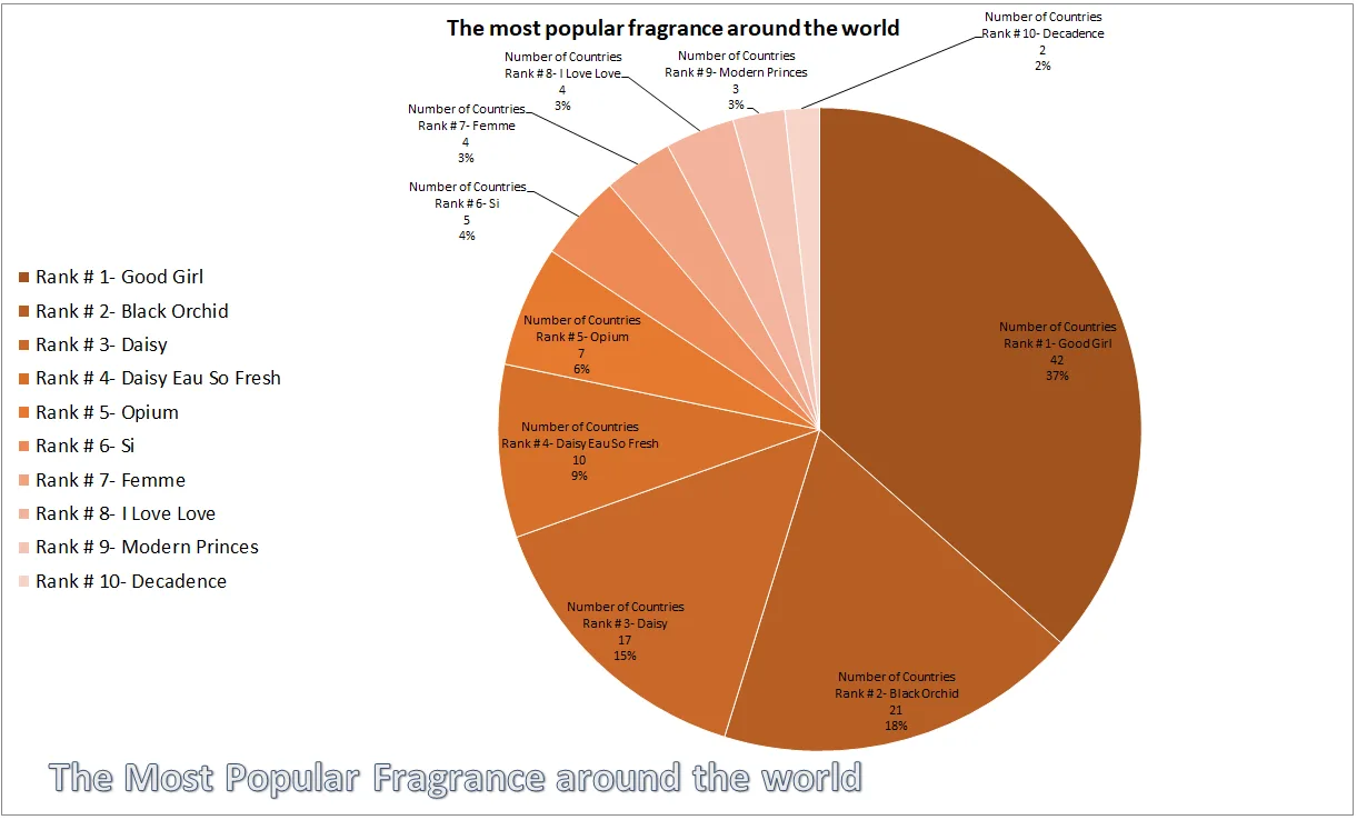
Below is an example data for top beauty product.
Serial
Top 05 Beauty Products sale in a minute
Unit
1-
MAC Lipstick Velvet Teddy
40
2-
Benefit They’re Real Lengthening Mascara
45
3-
Anastasia Beverly Hills Dipbrow Pomade
46
4-
Laura Mercier Translucent Loose Setting Powder
47
5-
MAC Lip Pencil Cork
48
Using too many 3D effects, shadows, or titles can make it difficult for viewers to understand the slices and make accurate comparisons, so it’s best to use a simple 2D pie chart.
When choosing a pie chart for your data, you need to make sure that the categories logically contribute to the overall picture. If the data doesn’t add up to a meaningful total, it’s better to choose another type of chart, such as a bar chart.
Similarly, follow the same protocol for percentage summation. The data ratio should be 100%.
It is not a good idea to use pie charts to show trends over time because pie charts are static and show proportions at a single point in time. Line charts or bar charts are better for seeing trends than pie charts.
Using too much text and labels directly on the chart can make it difficult for viewers to understand the slices.
Despite their simplicity and effectiveness, pie charts also have some drawbacks and several limitations.
Researchers say that it is difficult for the human eye to compare areas or angles of different slices when there is little difference in data values. In this sense, caution is needed when using pie charts.
Pie charts are not as good at showing exact values as others. In fact, pie charts primarily show ratios rather than exact numerical values. Labels can be used to show numerical values.
Not suitable for many categories because it is visually unappealing and one cannot extract the desired information from it.
The conflict of providing accurate details can be misleading. The use of exaggerated 3D effects or tilt can intentionally or unintentionally distort the perception of data.
Pie to pie,, You can take some values from the first pie and add them to the second pie to make smaller percentages more readable or to highlight the values in the second pie.
Bar of pie… can be used to show the proportion of a whole. Also, you can take some values from the first pie and combine them in a stacked bar to make small percentages more readable or highlight the values in the stacked bar.
3-D pie can be used to show the proportion of a whole or when numbers are 100%. Make sure the chart contains few slices.
Doughnut : Use this type of chart when you want to show a percentage of a whole. It’s better to use it instead of a pie chart when there are multiple series that relate to a large amount.
The best thing about these layouts is that you can make any kind of modifications according to your needs.
To customize the color and style, you get the option of ‘Chart Quick Colors,’ which gives you colorful and monochromatic palettes.
Moreover, you get ‘Quick Styles,’ in which you get a lot of styles for your chart. You can use these quick styles to change the overall visual style of the chart.
In short, there are so many options for chart styles that we need multiple articles that are enough to cover them all.
Remember, a pie chart is designed to show parts of a whole and illustrate relationships between different variables.
Finally, since a pie chart is an excellent and effective tool for representing overall proportions, some important precautions need to be kept in mind, and common and mentioned pitfalls should be avoided to make it effective.