Decision Makers need a quick and easy way to review the current ongoing trends; they do not have much time to read lengthy & complex data reports. Data visualization is an essential modern procedure that provides a means through which complex data sets can be transformed into clear and accessible visual representations so that decision-makers can get guidance for making the immediate insight offered by charts.
In today’s world, every company needs complete relevant data details not only to grow but actually survive; hence, one cannot deny the importance of data visualization, and it is an essential aspect of the modern present era.
Analytical processes through visuals offer decision makers identifying trends, tracking performance metrics, and comparing variables with ease. This particularly plays a vital role in environments where stakeholders need to make time-sensitive decisions based on the data presented. Instead of raw data, decision makers get a clear picture through graphs, charts, and diagrams that help them make timely decisions.
08 Examples of Microsoft Excel Charts for Displaying World Population
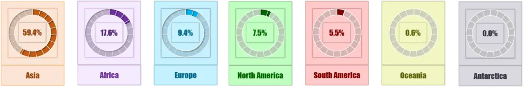
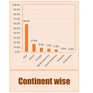
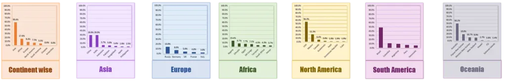
Let’s understand this with very simple figures, Supposing you want to share details regarding the world population by continent as of January 2025, you can share that Asia has 59.4% population, Africa has 17.6%, and Europe has 9.4% North America has 7.5%, South America has 5.5%, Oceania has 0.6% and Antarctica has 0%.
Apart from the above, there is another very effective and attractive option available to convey such information through graphs or charts. Using the facility of Microsoft Excel to create charts, I have prepared the chart below for your review.
The same data can also be displayed below through another type of chart.
Why Microsoft Excel?
There are several tools available for data visualization. Among them, Microsoft Excel has the ability to distill complex data into meaningful visuals that enhance understanding and support effective communication.
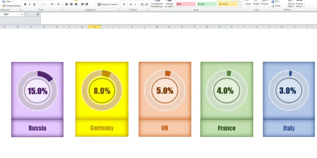
If you want to share the population details of top 5 European countries as of January 2025, you can share that Russia is 15%, Germany is 8%, United Kingdom is 5%, France is 4%, and the Italy is 3%.
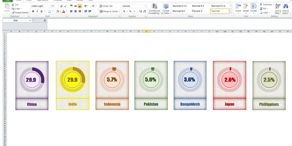
If you want to share the population details of top 7 Asian countries as of January 2025, you can share that China is 29.9%, India is 29.9%, Indonesia is 5.7%, Pakistan is 5%, Bangladesh is 3.6%, Japan is 2.6%, and the Philippines is 2.5%.
Now decide which method is more effective.
Excel offers unparalleled tools for creating charts that enable users to transform complex datasets into clear and easily interpretable graphical representations. What do you suggest regarding which way of presenting data information is attractive—the first or the bottom chart? I think the chart below can convey the full detail at a glance.
Chart Design & Analyzing Data by Microsoft Excel Charts
Microsoft Excel has many tools available to design charts according to your needs or requirements. There are many types of built-in charts available that can be customized to suit your needs and desires.
If we talk about the different types charts there are many. You can get options for many types of charts, most common chart types are column charts, lines, pie, bars, area, bubble, surface, donut charts, etc. each serving distinct purposes and suited for varying data analyses.
For example, a line chart can illustrate the growth of sales figures over time. On the other hand, a bar chart is used to compare different product categories.
There are several types of charts available in Excel, and each chart has its own unique strengths, allowing users to choose the appropriate format that best conveys the desired message.
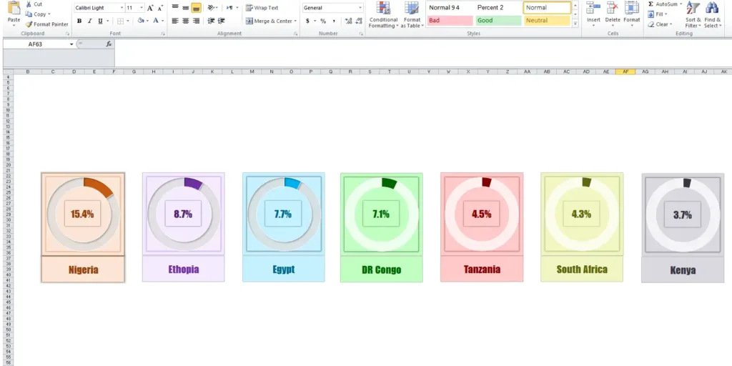
If you want to share the population details of top 7 African countries as of January 2025, you can share that Nigeria is 15.4%, Ethopia is 8.7%, Egypt is 7.7%, DR Congo is 7.1%, Tanzania 4.5%, South Africa is 4.3%, and the Kenya is 3.7%.
Now decide which method is more effective.
By these charts you can select the chart based on your data type or the best can define data. Some charts are available for presentation of specific data visualization.
Let’s have a quick review of Types of Microsoft Excel Charts
Excel provides a diverse array of chart types designed to facilitate effective data representation. Among the most common chart types are bar charts, line charts, pie charts, and scatter plots, each serving distinct purposes and suited for varying data analyses.
Excel provides several types of charts that are designed to make it easy to effectively represent data. Bar charts are ideal for comparing data across categories. They are rectangular bar views, where the length of each bar represents a value.
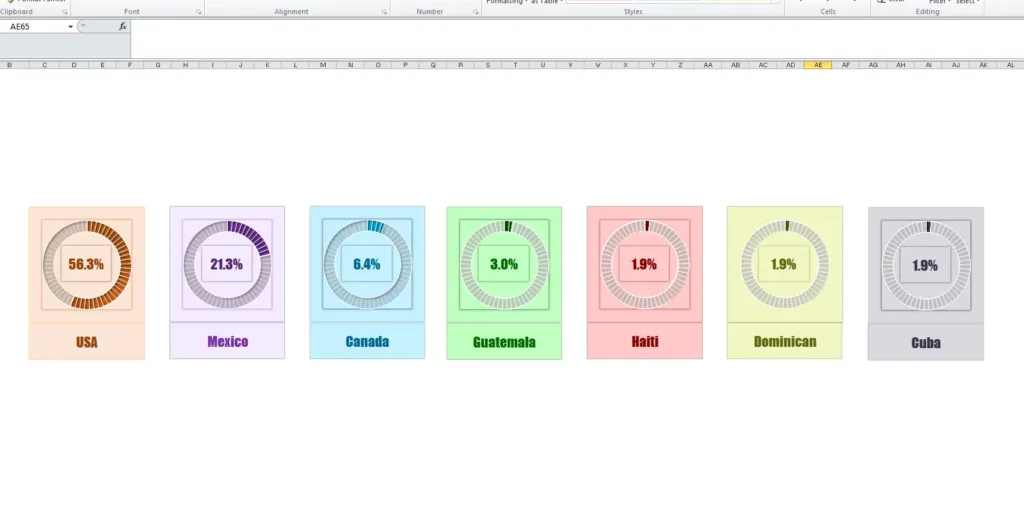
For top 7 North American countries, USA is 56.3%, Mexico is 21.3%, Canada is 6.4%, Guatemala is 3%, Haiti is 1.9%. But you can also share the details using the chart method given below.
Line charts are great for showing trends over time. These charts effectively illustrate changes and fluctuations, making them a great choice for time series data. Pie charts are used to show proportions of a whole, effectively showing how individual segments contribute to the total value.
Scatter plots allow users to visualize the relationship between two numerical variables. With pie charts, analysts can effectively identify correlations or trends within data.
There are many chart types available in Excel, such as scatter plots, area charts, histograms, and radar charts, each serving a unique purpose, ensuring that users can effectively convey their data insights.
Microsoft Excel charts are focused on engaging the audience. There is no doubt that visual information often resonates with viewers more than textual information. Creating charts is an effective way to capture attention and is useful for making productive decisions.
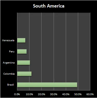
South America
Brazil
49.2%
Colombia
11.8%
Argentina
10.4%
Peru
7.8%
Venezuela
6.6%
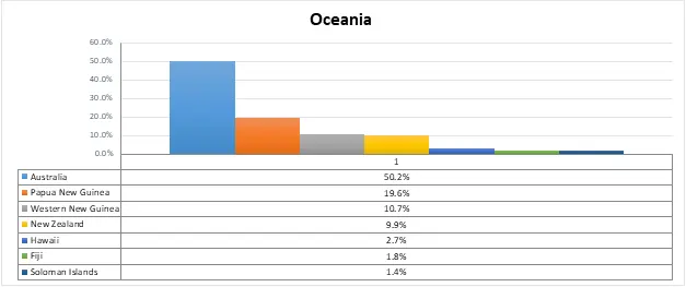
Oceania
Australia
50.2%
Papua New Guinea
19.6%
Western New Guinea
10.7%
New Zealand
9.9%
Hawaii
2.7%
Fiji
1.8%
Soloman Islands
1.4%
Microsoft Excel offers several Steps to Create Effective Charts
I would like to give a brief overview of Microsoft Excel charts here, but when you look at the options offered by Microsoft Excel charts in detail, you will find many options with which you can change the chart in many ways according to your need and desire.
For example, Microsoft Excel charts provides you with the best option of Format Chart Area, which enables you to change the color, border color, border style, shadow, glow, and soft edges in 3D format. Similarly, the Chart Resize option is also available, through which you can change the size of everything in the chart as per your wish.
The Data Source option enables you to display the data view in many ways. Options to change the plot area of the chart are also very helpful in customizing the chart.
Apart from this, there are many options available to customize the axes, numbers, fills, line color, line size, shadow, and data labels as per your need. Another great option in Microsoft Excel is chart recommendations. When you select data, you can get recommendations from the program about which type of chart would be best for your data.
Summary of All Data Charts
Furthermore, when you select any type of chart, you get more options; for example, if you select a clustered column chart, you get more types of clustered charts like stacked column charts, 100% stacked columns, 3-D clustered columns, 3-D stacked columns, 3-D 100% stacked columns, and 3-D stacked columns.
Similarly, when you select Pie Chart, you get more options like 3-D Pie, Bar to Pie, Pie to Pie, and Dashed Note. In fact, when you select any type of chart, like a line, bar, etc., you get many options using which you can display the data in a detailed and visually appealing way.
Conclusion
It is becoming increasingly difficult for decision makers to make informed decisions by quickly understanding patterns, trends, and anomalies from raw data alone.
Proper use of Microsoft Excel charts can not only enhance understanding but also improve analytical results. Additionally, analysts can highlight key findings and insights when interpreting data.